

How to Choose Table Linen Colors for Your Dining Room
To choose table linen colors for your dining room, start with the colors already present in your furniture, walls, and dinnerware. Neutral linens create a calm foundation, while richer shades can add warmth or make the table a focal point. The key is to balance color, texture, and atmosphere so your table setting feels intentional, whether for everyday meals or special gatherings.
How do you choose table linen colors based on your dining room?
Choose table linen colors by considering your dining room’s dominant palette, furniture finishes, and lighting. The most harmonious choice either complements existing undertones or introduces a deliberate contrast that connects with other elements in the room.
Follow these five steps to find the right balance:
- Identify your room’s dominant colors. Look at the walls, flooring, rugs, and upholstery. Warm interiors often suit ivory, oatmeal, or terracotta, while cooler palettes may complement sage, dusty blue, or soft gray.
- Consider your dining table’s wood finish. Golden oak and warm walnut can pair beautifully with natural flax, cream, or muted olive. Gray-washed wood may harmonize better with cooler neutrals. Dark wood offers an elegant backdrop for lighter linens.
- Decide between harmony and contrast. Choose similar undertones for a cohesive, understated setting. For a more expressive table, introduce a contrasting runner or napkins, ideally echoing a color already present in your artwork or décor.
- Evaluate the lighting. Natural and artificial light can change how fabric colors appear. A cool-gray textile, for example, may develop an unexpected yellowish cast under certain lighting conditions, as illustrated in Sherwin-Williams' color and lighting education.
- Test the linen in your actual dining room. Place it beside your tableware and furniture, then examine it in daylight and evening light.
The same linen may look refined in one dining room but visually disconnected in another. Let your room’s existing character guide the final choice.
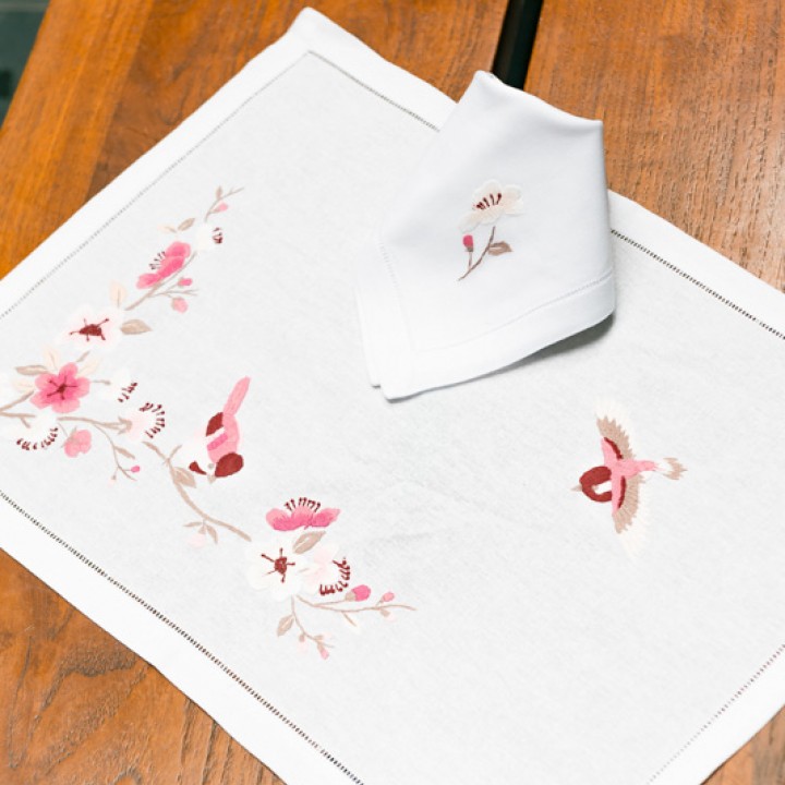
How should you match tablecloths, runners, placemats, and napkins?
To coordinate table linens elegantly, use the tablecloth as your dominant color, runners and placemats as supporting layers, and napkins as subtle accents. Choose complementary tones rather than matching every piece exactly.
The best combination depends on your existing dinnerware, tabletop, and desired atmosphere.
| Color approach | Tablecloth | Runner & placemats | Napkins | Overall effect |
|---|---|---|---|---|
| Tonal | Ivory | Cream runner, ecru placemats | Warm beige | Understated elegance |
| Analogous | Sage green | Olive runner, natural beige placemats | Soft green | Organic, harmonious |
| Complementary | Navy blue | Light-blue placemats | Muted orange | Refined contrast |
| Neutral with accent | Champagne | Taupe runner, cream placemats | Burgundy | Warm, sophisticated |
| Earth-inspired | Beige | Brown runner, woven placemats | Terracotta | Natural, inviting |
Consider your dinnerware before selecting colors. White porcelain accommodates almost any palette, while patterned ceramics benefit from quieter linens. Dark stoneware pairs beautifully with ivory, champagne, or soft gray.
For simple settings, the 60–30–10 principle offers a useful starting point: approximately 60% dominant color, 30% supporting tones, and 10% accent.
However, these proportions are flexible. If your table features patterned dinnerware, embroidered linens, or richly textured wood, prioritize visual balance over fixed percentages.
The finishing touch: Repeat one accent color in a small decorative element, such as a vase or napkin ring. This creates continuity while allowing each handcrafted textile to retain its distinctive character.
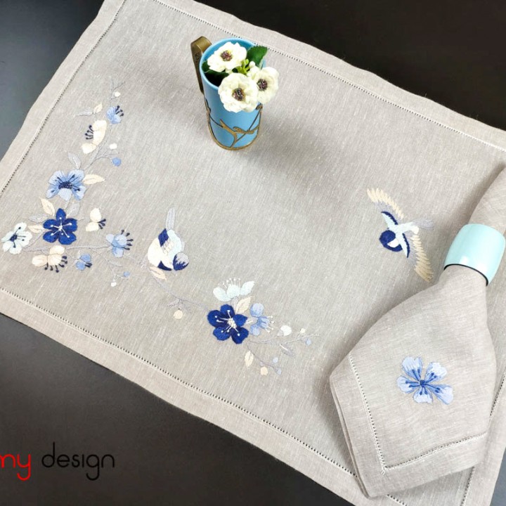
Which table linen colors create the atmosphere you want?
The best table linen color depends on the atmosphere you want to suggest and how the fabric complements your dining room. Neutral, warm, cool, muted, and saturated palettes offer different visual possibilities, but their effects depend on lighting, tableware, and surrounding materials.
| Color palette | Table linen examples | Possible atmosphere | Best paired with |
|---|---|---|---|
| Neutral | Ivory, cream, beige, taupe | Understated, timeless, refined | Natural wood, ceramic tableware, delicate embroidery |
| Warm | Terracotta, rust, coral, warm brown | Welcoming, intimate, convivial | Wooden furniture, brass accents, cream ceramics |
| Cool | Dusty blue, slate blue, blue-green | Fresh, composed, quietly elegant | White porcelain, glassware, pale wood |
| Muted | Sage green, olive-gray, dusty rose | Soft, earthy, restrained | Linen textures, handcrafted ceramics, natural centerpieces |
| Saturated | Emerald, burgundy, deep navy | Bold, expressive, dramatic | Neutral dinnerware, metallic details, contrasting napkins |
The distinction is visual, not a fixed emotional rule. Research links color saturation and brightness with perceived arousal, while color-combination studies show that harmony and preference are not necessarily the same.
For example, a muted sage-green tablecloth may provide a quieter backdrop for hand-embroidered napkins, while emerald green can make the setting more visually prominent.
Before choosing, compare fabric samples beside your actual dinnerware in daylight and evening light. The most suitable palette is one that complements the entire table setting, not simply a color associated with a particular mood.
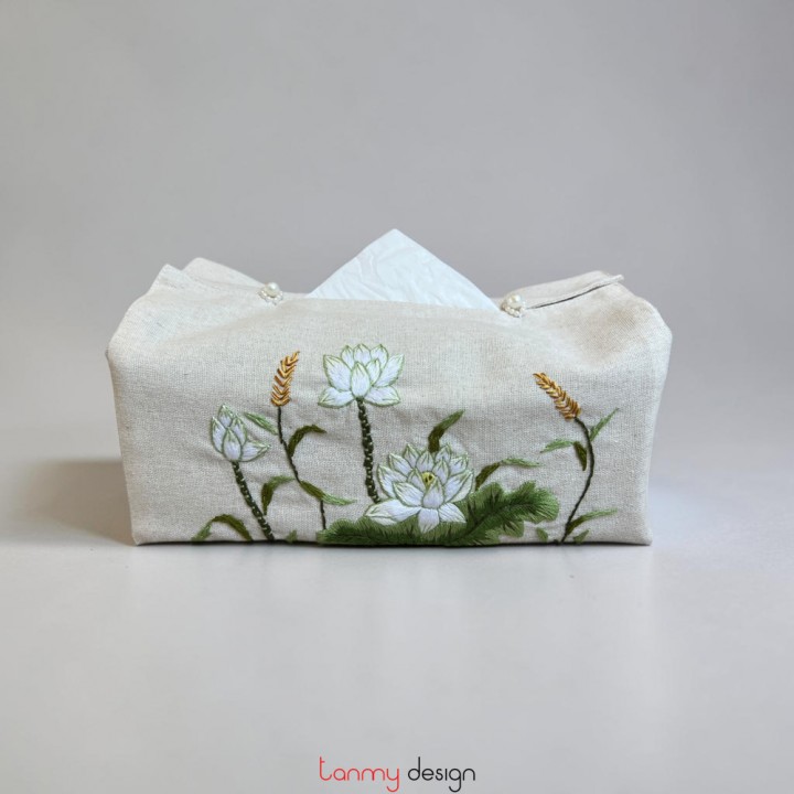
How should table linen colors change for everyday dining and special occasions?
For everyday dining, choose understated, versatile table linen colors, then introduce richer tones, refined textures, and decorative accents for special occasions. A neutral foundation allows you to refresh the atmosphere without replacing the entire table setting.
Consider a cream linen tablecloth as the foundation for three different dining experiences:
- Everyday dining: Pair the cream tablecloth with beige placemats, simply folded cotton napkins, and a small ceramic vase. The restrained palette creates a relaxed, welcoming setting.
- Formal dinner: Keep the same tablecloth, adding a tonal linen runner, ivory napkins folded over charger plates, candles, and a low floral arrangement. The coordinated layers lend elegance without overwhelming the table.
- Autumn or festive gathering: Introduce a burgundy or olive-green runner, terracotta napkins, and seasonal greenery. These warmer accents create a distinctive atmosphere while preserving the original foundation.
The practical distinction is that occasion changes need not require a completely different tablecloth color. Instead, adjust the smaller layers to create the desired mood.
For frequently used linens, consider fabric composition and care instructions alongside color: darker shades are not automatically easier to maintain, and embroidered details may require gentler cleaning.
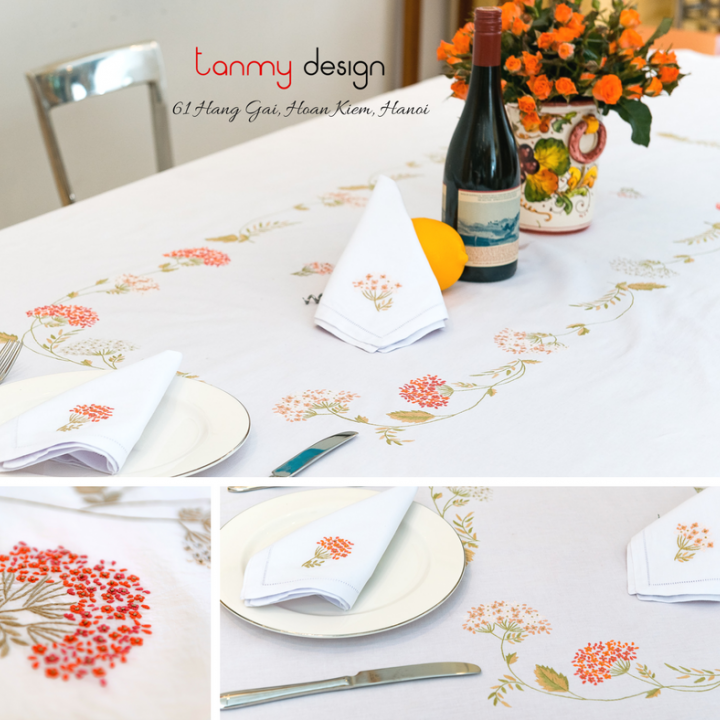
How do patterns and hand embroidery affect table linen color choices?
Patterns and hand embroidery influence table linen color choices by introducing additional colors, visual detail, and focal points. The key is to coordinate the fabric's background color with its embroidered motifs while keeping the overall dining setting balanced.
For patterned or hand-embroidered table linens, consider three elements: the fabric's base color, the embroidery thread colors, and the scale of the decorative motif. A neutral background allows intricate embroidery to stand out, while coordinating the thread colors with tableware creates a more cohesive arrangement.
For example, Tân Mỹ Design's lotus-embroidered placemat and napkin set lists four combinations: white/pink, beige/pink, white/white, and beige/white. White/pink can introduce a gentle floral accent alongside plain white ceramics, while beige/white offers a more understated palette.
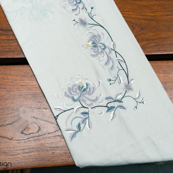
Similarly, the orchid-embroidered linen table runner, listed in white/blue and measuring 40 × 200 cm, provides a potential focal point for a dining table. Pairing it with simple white tableware can keep attention on the embroidered design, while carefully selected blue accents can reinforce its color scheme.
Pattern scale also matters. When combining embroidered runners, placemats, and napkins, consider using one prominent motif and quieter surrounding pieces to avoid visual competition.
Do not assume that similarly named floral designs share identical thread colors or form a coordinated collection. Check each product's documented colors, material, dimensions, and photographs before combining pieces.
The most effective choice preserves the embroidery's character without overwhelming the dining room's existing palette.
How can you test your table linen color combination before buying?
To test your table linen color combination before buying, compare actual fabric samples with your dinnerware under different lighting conditions, then check how the colors, textures, and patterns work together in your dining room.
Follow these six steps to make a confident choice:
- Request physical fabric samples. Choose swatches of your preferred table linen colors. Online photographs may not accurately represent fabric shades because screen settings, lighting, and textile textures influence color appearance.
- Compare colors with your dinnerware. Place each swatch beside your plates, glasses, and cutlery. Examine warm and cool undertones, particularly with neutral shades such as ivory, beige, and grey.
- Test under different lighting. View the combinations in daylight and under your dining room lights. Colors that coordinate in one setting may appear different under another, a phenomenon known as metamerism.
- Check texture and pattern balance. Compare smooth, textured, and embroidered fabrics alongside your tableware. Consider whether decorative details complement or compete with patterned plates.
- Create a complete table setting. Arrange the tablecloth, runner, placemats, and napkins together. Check their proportions, color harmony, and visual balance.
- Verify product details and care instructions. Confirm the exact fabric color, dimensions, and cleaning requirements. For important purchases, request a sample matching the intended product variation.
Choose the combination that remains visually harmonious under your actual dining conditions, rather than relying solely on how the fabric appears online.
The most successful table settings feel coordinated without looking overly matched. If your dining room already has strong colors or patterns, choose understated linens to create balance. For a neutral space, introduce personality through colored napkins, runners, or subtle patterns.
Before making your final choice, test your preferred colors in natural and evening light alongside your dinnerware. A thoughtfully chosen palette can bring lasting elegance to everyday dining and special occasions.
Other articles
_cr_720x720_cr_336x264.jpg)
Tablecloth, Runner or Placemats? Choose by Table & Occasion
How to Choose Tablecloth Size: Measure, Calculate & Fit

Vietnamese Silk Scarf Motifs: Meanings & Gift Choices
Square vs Long Silk Scarf: Which Makes a Better Gift?




Add: 61 Hang Gai St., Hoan Kiem Dist., Hanoi, Vietnam
Hotline: +84 936631368
Email: info@tanmydesign.com